The growth of almost any online business depends on traffic and conversion rate.
Whether you want visitors to join your newsletter or buy your product, the conversion rate is highly interlinked with your landing page elements.
Let me cite an example.
Consider monthly traffic = 100,000
Average product price = $10
Average conversion rate = 3% (Means 3 out of 100 people will end up buying the product)
Now, if you somehow manage to increase your conversion rate (I’ll show you how) by 0.5%, this is what the result looks like →
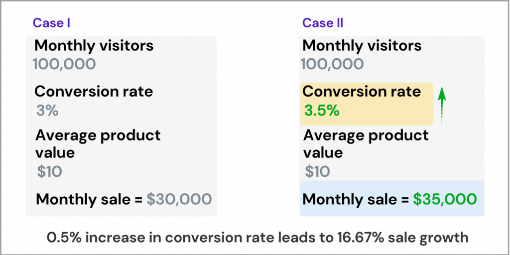
Increasing the conversion rate only by 0.5% may lead to a 16.67 % increase in sales.
This is how important and powerful is optimizing your landing page for better conversion.
One way of optimizing your landing page for better conversion is by adding social proof.
But here’s the thing:
The role of adding social proof on a landing page is to solve questions and reduce concerns. But when done wrong, it may create anxiety and doubts in the visitor’s minds.
Here are a few of the mistakes:
Often you may see a testimonial of the page without the name or designation of the person.
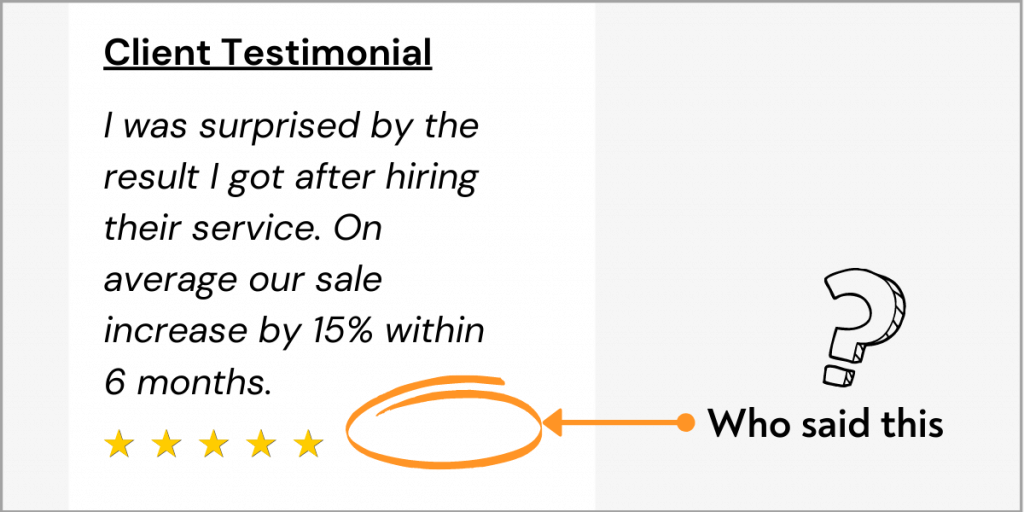
Another one.
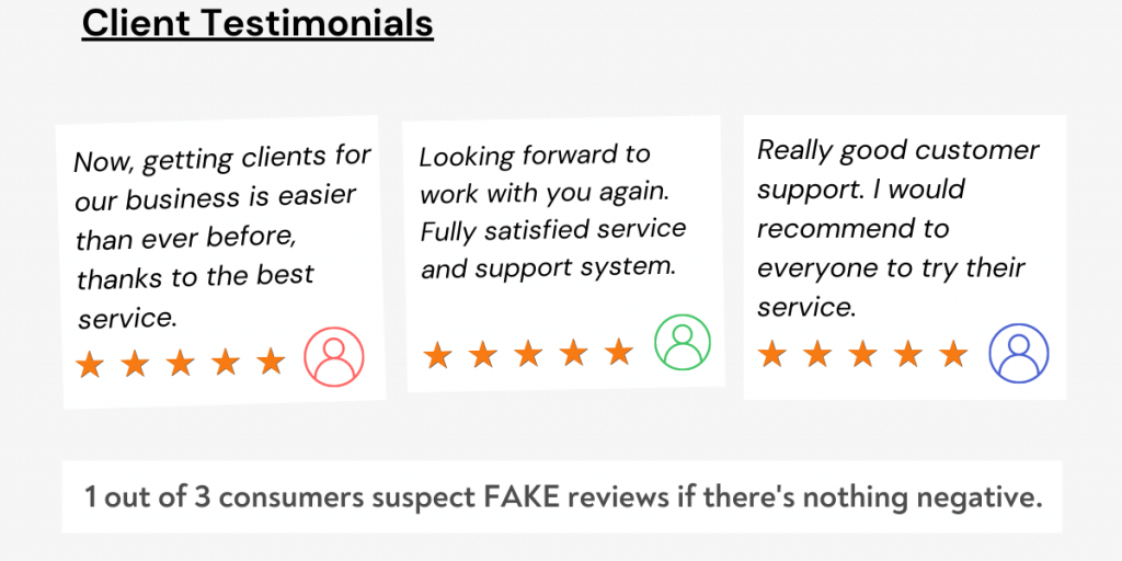
- Adding fake reviews just for the sake of it. In fact, “1 out of 3 consumers suspect FAKE reviews if there’s nothing negative” (Source: Revoo research report).
Even this isn’t enough.
The point here is social proof can either make or break the conversion. So it is always necessary to leverage social proof to boost conversion, not to reduce it.
And, in this guide, you’ll learn how you show social proof and some examples of best and bad social proof.
Let’s jump into the effective ways of adding social proof on your landing page.
How to use social proof effectively?
💡 130+ Free Content Marketing Resources
CRO expert Angie Schottmuller coined the term CRAVENS, an effective way of scoring your landing page based on social proof.
Craven stands for Credible, relevant, attractive, visual, enumerated, nearby, specific.
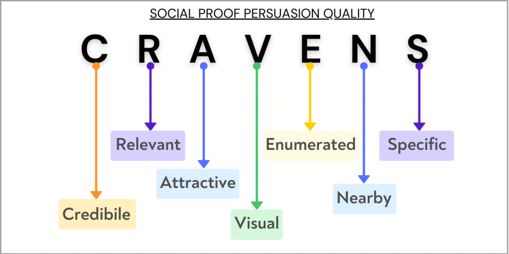
Watch her whole presentation on social proof and landing page conversion.
Let’s break down each element of CRAVENS one by one.
Credible
Having a landing page credible enough is important to make visitors believe in the brand or product you’re offering.
As shown above, a testimonial without a real name is hard to believe, whereas showing credible experts saying positive things about your product will leave a good impression on your visitors.
Here are some of the ways you can make your page credible enough to pass the CRAVENS scorecard.
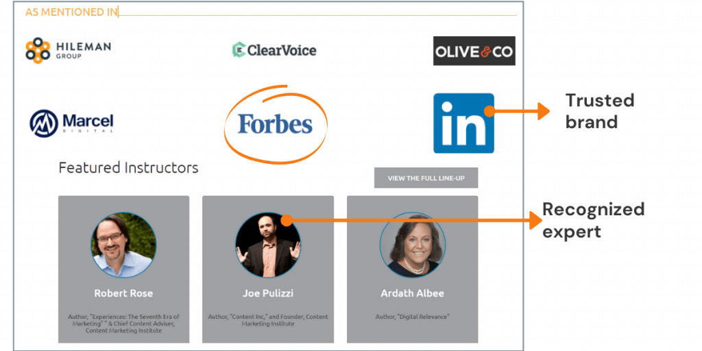
1. Include industry experts or reputed brand
Here’s a great example of showing recognizable experts and leading brands in the market as a supportive product element.
2. Reviews
Reviews from past customers help build trust with your prospect but don’t ruin it by adding fake reviews.
Also, a review/testimonial without a real name and image doesn’t seem to be original.
While adding testimonials from your clients, consider the following framework.
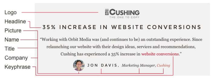
There’s nothing you need to worry about credible testimonials if you follow the above guideline.

“Social proof must reduce anxiety to optimally aid conversion“
— Angie Schottmuller (Director of Interactive Strategy & Optimization at Three Deep Marketing)
Relevant
The more relevant your landing page or product will be to the visitors, the higher the conversion rate you may get.
Usually, landing pages have common elements such as:
- Testimonials from a real person with their name and job title
- Brand logos of ex-clients
- Review content (Testimonial message)
- Locations from people who already bought your product
- And few others…
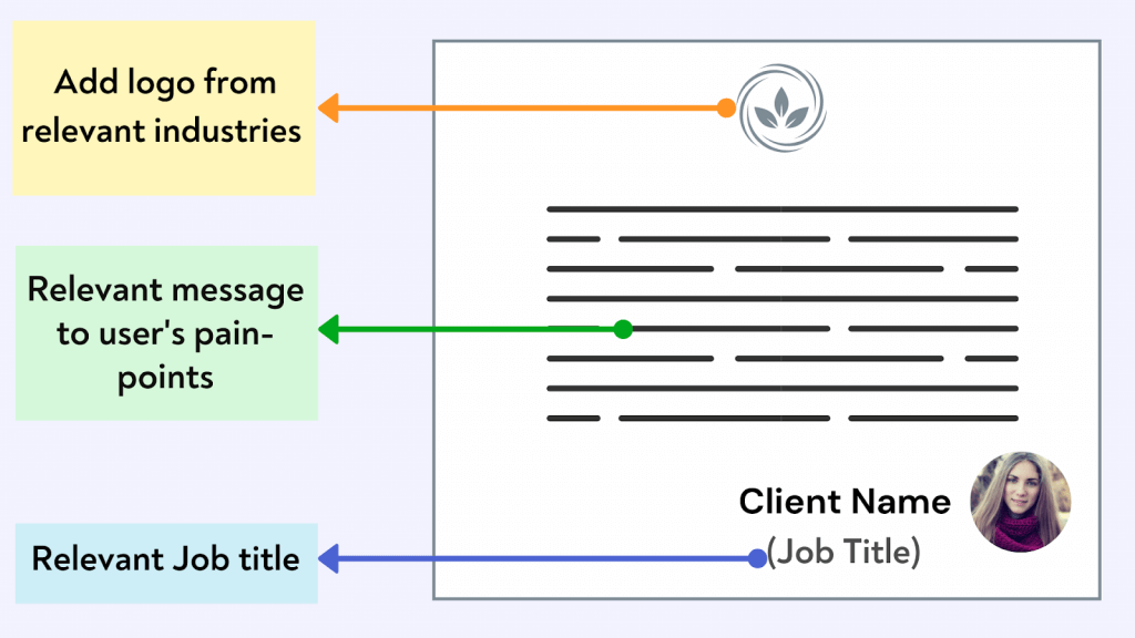
All of the above elements of a landing page are an opportunity to present your product, service relevant to the user.
Here are some of the ways you can make your page more relevant:
Attractive
The attractive part of the social proof deals with the initial hook or the emotional aspect.
Here’s a great example:
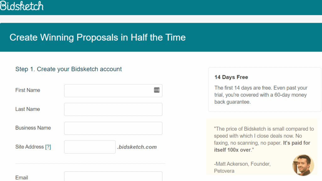
Instead of any sub-text, they have used testimonials that solve the pain-points from a user perspective. The goal here to encourage people to signUp for the free trial by answering the important question about the price (that too by adding a real testimonial)
Relevant: Build Content strategy for your business seamlessly
While making your landing page, you need to identify the pain-points of users and answer them creatively. Here BidSketch used testimonial content to clear user’s doubts.
But identifying the pain-points is a little bit challenging, especially if you don’t have a large enough audience to do a survey.
In that case, you may consider these tips to find pain-points of your prospect:
Tip 1: Leverage relevant community
First of all, make a list of a few online groups or forums. You can start your research from Facebook or LinkedIn groups, Reddit, Quora, etc.
Make sure your target audience spends time on those groups or forums.
Second, have conversations with the group members. Even better, ask questions relevant to your product or the problem that it slaves.
Here’s what I did for my newsletter registration page:
I asked what features they would expect from a premium newsletter in a Facebook group.
As a result, I got to know many pain-points or user’s needs regarding a paid newsletter.
A few more.
Once I have enough information about the pain-points and their needs, I can create a landing page that easily resonates with the target audience.
As a result, I focused on the message highlighting that the newsletter is simple to digest, short, and straightforward.
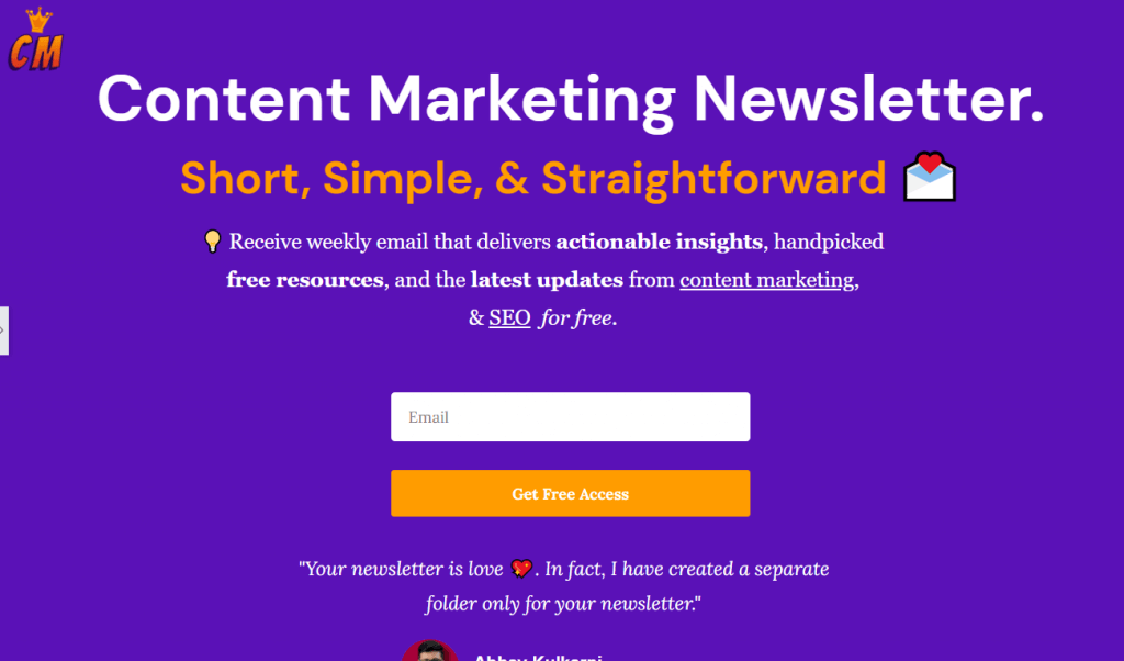
Relevant: Join the content marketing newsletter that delivers practical strategies and expert insights every Monday
Visual
Now, you have already added relevant testimonials, brand logos, trusted experts as a supportive element in the landing page. But how can you visualize the experience in an even better way?
It’s by adding your customer-shared images.

By combining all of these small elements, you’re more likely to convert a stranger into a lead.
Always look for user-shared content and images on social media and also regularly track brand mentions.
When it comes to visualizing and making your landing page attractive, many people make the mistake of overdoing it.
Some of the common mistakes to avoid for a focused landing page
- Adding external links
- Colored brand logos
- Not enough color contrast for the hero image and SignUp button
Your goal should be to make your most important elements of the landing page visually appealing.
Enumerated
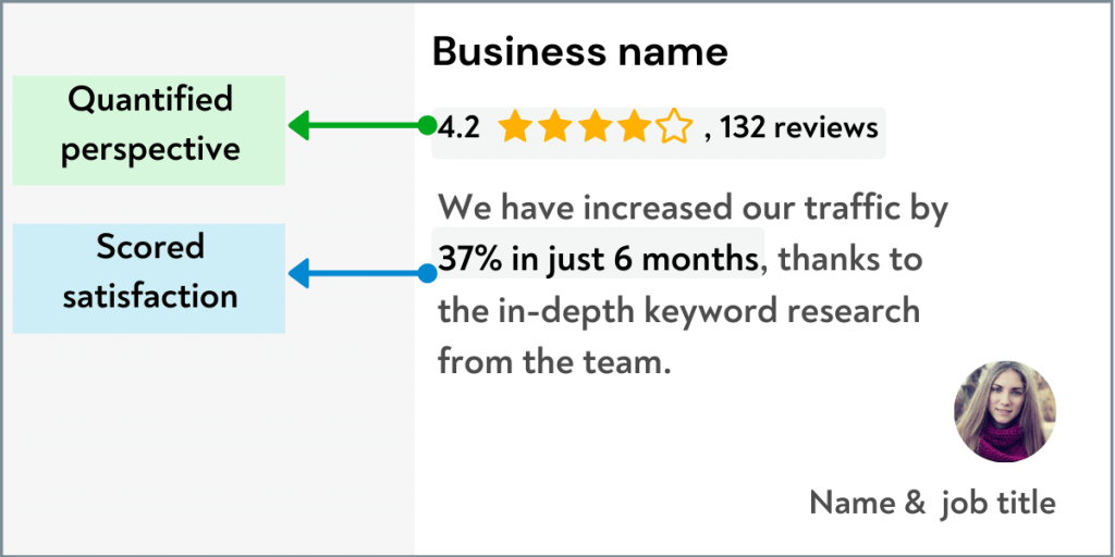
Now it’s time to make your page more credible by adding numeric or quantified metrics.
Take an example from the Orbit media email signUp form in the footer.
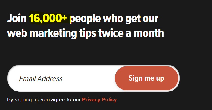
The number of subscribers who receive newsletter updates shows a strong sign of credibility.
Likewise, you can find different ways to quantify your metrics, such as number of clients, number of subscribers, number of social shares, etc.
Nearby
Often you’ll see pages where the testimonial is at the bottom of the page. That means to see the valuable testimonials; you need to go to the bottom of the page.
To make your testimonial content more effective, place it near the CTA.
Here’s an example of adding reviews near the CTA.
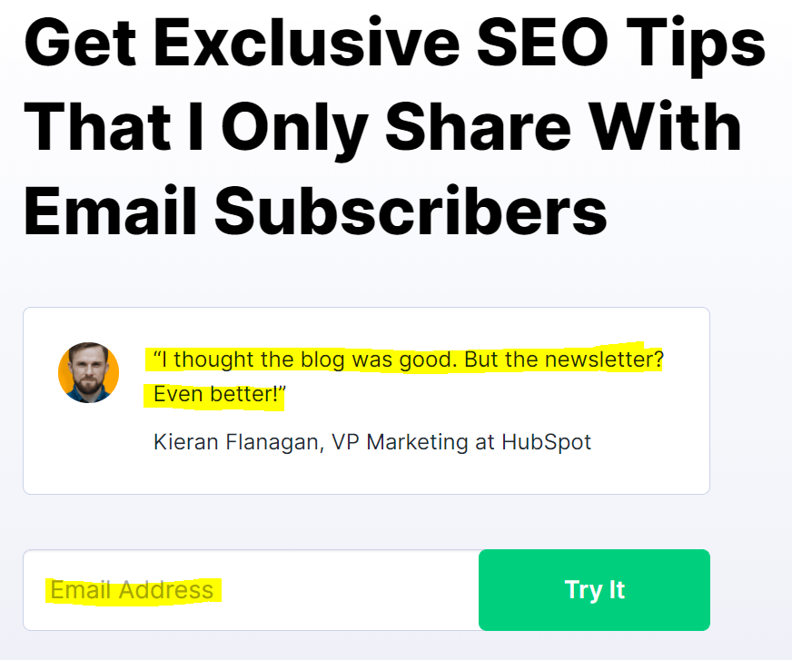
TIP: To get detailed insights on the user-behavior on the page, consider using a heat map that will tell you whether users are scrolling down enough or not.
Specific
In simple words, avoid everything that is too generic, whether it is the headline, testimonial, or even CTA.
Make sure your landing page is specific enough to answer the following questions:
- Who is this for? (Be clear to highlight the target audience for your product, offer)
- What benefits will I get? (Show them the benefits that they will receive when they complete the signUp or buy a product)
- Why is now the best time to take action? (Sale session, limited time offer or any other ways to get users to take action right away)
- How often? (For newsletter, you should tell how often you send emails)
Once you combine CRAVENS elements, you’ll come up with a better version of the landing page.
[Tip: Instead of completely redesign your existing page, you should have enough data so you can compare the results between both versions.]
Cravens scorecard
Now, what if you could score your landing page based on the CRAVENS elements?
Surely, this will give you an overview of where your page is standing now.
This is why Angie Schottmuller has created the CRAVEN scorecard that you can use to score your testimonials, overall persuasion value.
Check the below illustration:
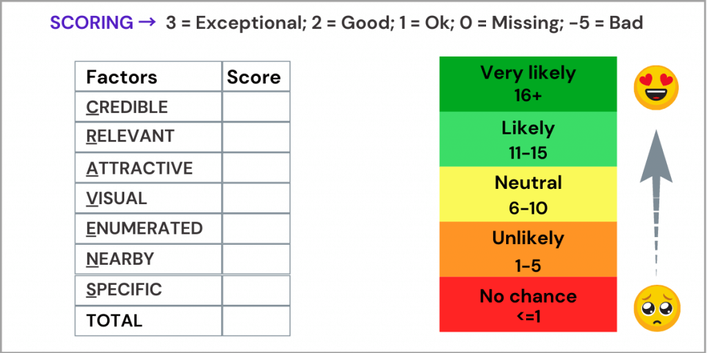
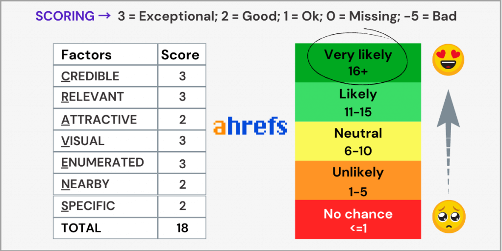
The cravens scorecard ranges from <1 to 16+. The higher the score your landing page gets, the better it is in terms of persuasion.
To optimize your landing page for better conversions, implement these actionable social proof strategies:
- Show Authentic Testimonials: Use real customer testimonials with names and photos to build credibility.
- Highlight Success Metrics: Display quantifiable achievements, like the number of satisfied customers or positive outcomes.
- Position Testimonials Near CTAs: Place testimonials close to call-to-action buttons to alleviate doubts.
- Incorporate User-Generated Content: Feature images or reviews from customers on social media to enhance relatability.
- Use Trust Badges: Add security seals or certifications to increase trustworthiness.
By Shantanu Pandey, Co-founder of Tenet, an CRO agency in India
Guide to using the CRAVENS scorecard:
Step 1. For every element of cravens (credible, relevant, attractive, visual, enumerated, nearby, specific), you need to score your landing page between 3 points (exceptional) and -5 points (bad).
Step 2. Once you’re done with scoring these seven factors, you have to check the total score.
Step 3. If your landing page’s total score is somewhere between 11 to 16+, it is considered good.
But if it’s less than 11, consider going through these 7 important elements to see which part you’re missing.
💡 130+ Free Content Marketing Resources
Examples of social proof and its performance
To get a better understanding of how you can score your landing elements, let me show you some real examples:
1. Cravens score for review:
Even you can apply the same concept for your reviews as well. In this case, I’ve chosen the review from a landing page that is focused on selling a product management course.
Take a look at the page first.
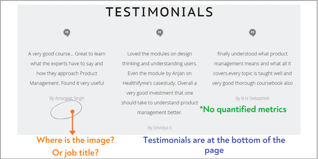
And, here’s the Cravens score:
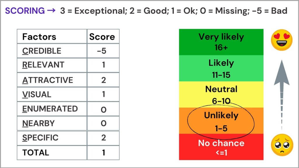
Things to improve:
- Adding faces of clients with their job title.
- Even better if the job title is similar to the target audience
- Testimonials are placed at the bottom of the page. In general, having them near the CTA helps in reducing anxiety.
- No quantified metrics such as any measurable improvement from clients by purchasing the course. Also, genuine rating system is missing.
Overall, the social proof is unlikely to persuade the audience considering all the CRAVENS factors on the page.
2. Cravens score Saas Home page:
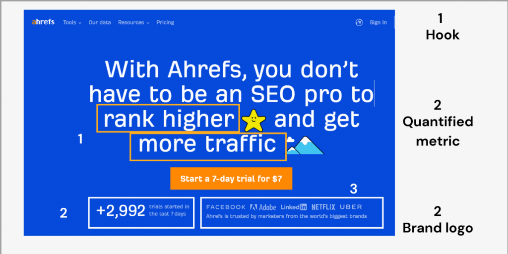
One of my favourite landing pages in the SaaS category is from Ahrefs (SEO tool). Once you visit their home page, you’ll instantly get hooked by the heading. Also, quantified metrics like ‘number of trials started in the last 7 days‘ is also a bonus.
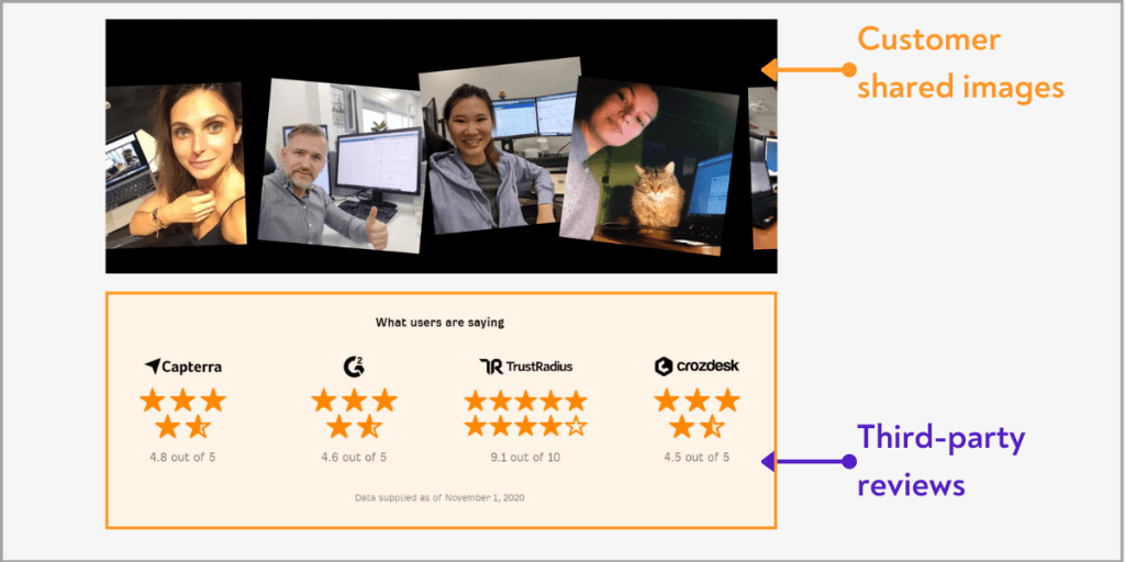
Also, the home page shares user-shared photos, which look cool. So, if you’re into SaaS, you should look at Ahrefs for inspiration.
Let’s look at the CRAVENS score for Ahrefs:
To optimize your landing page for better conversion rates, implementing social proof effectively is crucial. The CRAVENS framework provides a structured approach to assess and enhance your landing page. Below is a detailed breakdown of the CRAVENS elements along with actionable steps.
CRAVENS Framework Overview
The CRAVENS acronym stands for:
- Credible
- Relevant
- Attractive
- Visual
- Enumerated
- Nearby
- Specific
1. Credible
Objective: Establish trustworthiness.
- Action Steps:
- Include testimonials from real customers, ideally with names and job titles.
- Feature endorsements from industry experts or recognizable brands.
- Avoid fake reviews; authenticity is key to maintaining credibility.
2. Relevant
Objective: Ensure content resonates with the target audience.
- Action Steps:
- Use testimonials that reflect the experiences and pain points of your target demographic.
- Incorporate brand logos of past clients to enhance relevance.
- Conduct surveys or engage in community discussions to identify user needs.
3. Attractive
Objective: Capture attention through emotional appeal.
- Action Steps:
- Design your landing page to highlight testimonials that address user pain points.
- Use compelling headlines and subtexts that resonate with visitors’ emotions.
- Ensure the layout is clean and not overcrowded with information.
4. Visual
Objective: Utilize visuals to enhance engagement.
- Action Steps:
- Include user-generated content, such as images shared by customers using your product.
- Avoid excessive visual clutter; focus on key elements that guide the user’s attention.
- Ensure high contrast between text and background for readability.
5. Enumerated
Objective: Quantify success to build trust.
- Action Steps:
- Display metrics such as the number of satisfied customers or successful product uses.
- Use statistics to highlight achievements (e.g., “Over 10,000 happy customers”).
- Incorporate social share counts or subscriber numbers to demonstrate popularity.
6. Nearby
Objective: Position testimonials strategically for maximum impact.
- Action Steps:
- Place testimonials close to call-to-action (CTA) buttons to reinforce trust just before conversion.
- Use heat maps to analyze user behavior and adjust testimonial placement accordingly.
7. Specific
Objective: Avoid generic messaging; be clear about your offering.
- Action Steps:
- Clearly define who the product is for, what benefits users will gain, and create urgency (e.g., limited-time offers).
- Specify how often users can expect communication (e.g., “Weekly newsletter updates”).
Implementation Strategy
- Audit Current Landing Page:
- Evaluate existing elements against the CRAVENS framework.
- Identify gaps in credibility, relevance, or specificity.
- Gather Data:
- Collect authentic testimonials, metrics, and images from users.
- Engage with potential customers through surveys or social media to understand their needs better.
- Revise Content:
- Update landing page content based on insights gathered from the CRAVENS analysis.
- Ensure all elements align with the framework’s principles.
- Test and Measure:
- Implement A/B testing to compare the revised landing page against the original.
- Use analytics tools to monitor performance metrics like bounce rates and conversion rates.
- Iterate Based on Feedback:
- Continuously gather user feedback and make adjustments as necessary based on performance data.
Final words
Surely social proof is one of the most important elements of a landing page. And, CRAVENS scorecard is one way of checking how effective your social proof is.
Make sure you go through your CRAVENS score before making your page lie. This will allow you to find the leakage from your landing page.
That’s all for now.

Sk Rafiqul Islam is a content marketing practitioner with 3+ years of practical experience. He spends most of his time helping businesses to build a loyal audience with content marketing. He is also running a tech career blog called 10Pie and content marketing VIP, a bi-weekly marketing newsletter. In his free time, he loves reading books and playing football.
