
Quality content and backlinks are probably the two most important pillars in SEO-driven content marketing.
Here’s the fact:
If the user experience of blog articles is poor, it will affect the content readability, conversion, and even in acquiring links.
Therefore, you have to improve the blog UX to win the content marketing game in the long term.
Here, I will share 6 UX design principles for blog articles that you can implement right away.
Let’s get started →
1. Time To Value
If you’ve closely noticed the SERP patterns, you’ll see that Google is focused on providing users the information that they want faster.
Here are some examples:
Example 1 →
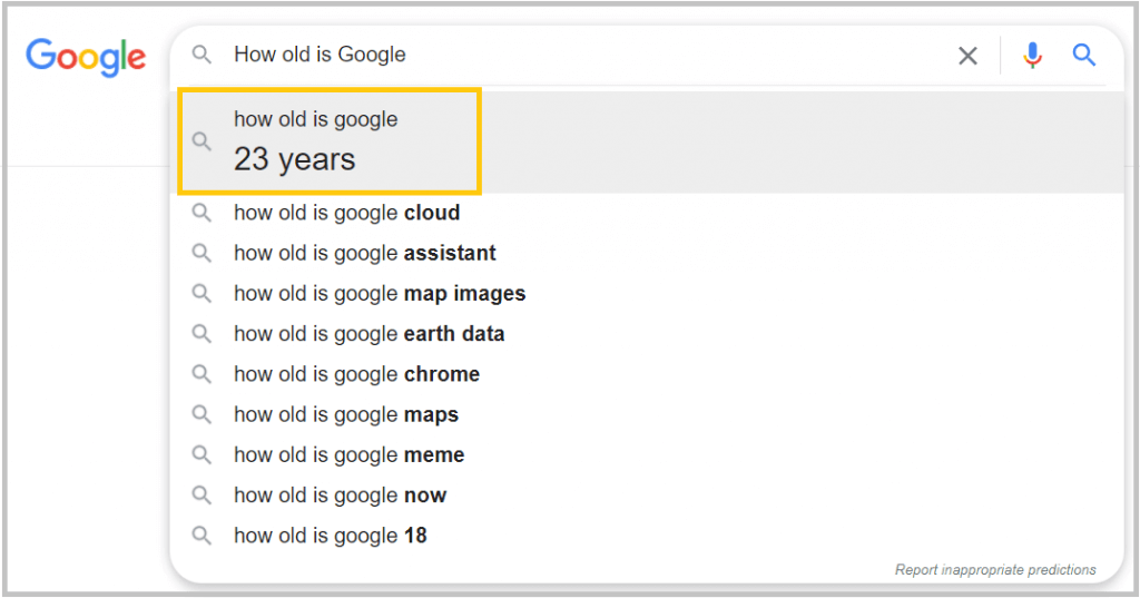
Search term: ‘How old is Google’
Time to value: Very low as you don’t even need to click on the search button.
Example 2 →
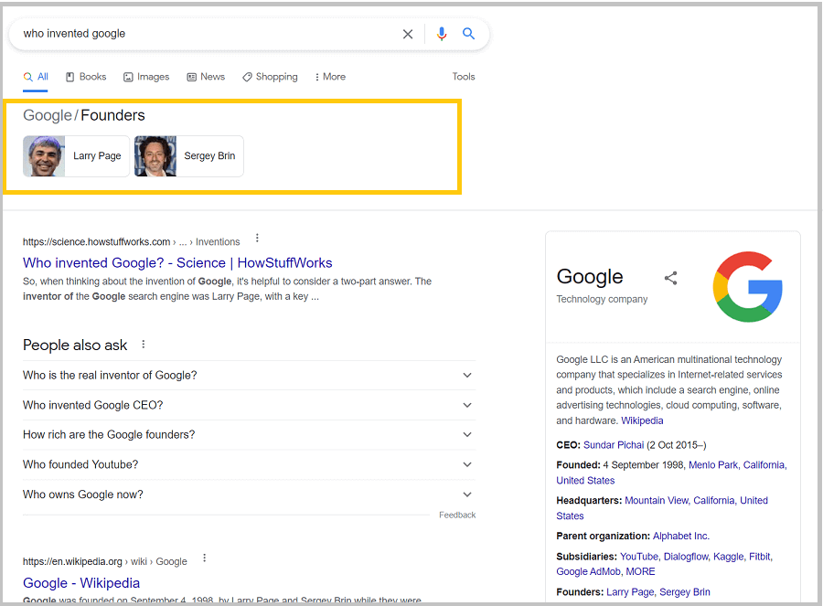
Search term: ‘Who Invented Google’
Time to value: Low [Here, you don’t need to visit any webpage to find the answer.]
Example 3 →
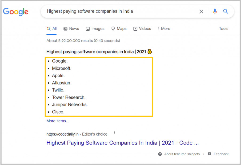
Search term: ‘Highest-paying software companies in India’
Time to value: Low as the user can quickly see the list of resources without visiting any article.
From the above examples, you can understand that having time-to-value low will help the readers find the information faster.
Likewise, one of the best ways to win at blog UX is reducing the time to value as much as possible. That means helping readers to find the required information faster.
Sharing some examples where the time-to-value is comparatively low:
Example 1: How-to Articles
‘Search Engine Watch’ does this by providing a 30-sec summary at the beginning of each article.
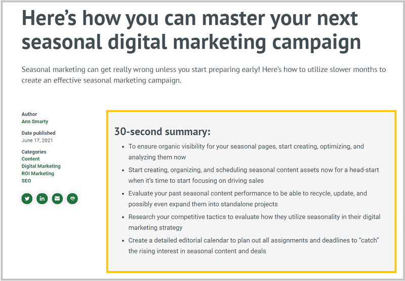
This not only helps the readers to get a quick overview of the article but also find the important information faster.
Relevant read: Content marketing examples to get inspired
Example 2: Data led content
Publishing original research-based articles or a statistics page? Then consider this idea.
Every year I publish a data-driven article related to digital marketing statistics. These types of articles have lots of interesting data points and findings.
Therefore it is important to create a section at the beginning of the article that highlights all the key findings from the research.
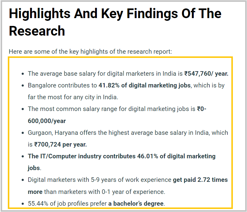
Benefits?
> First of all, this helps users to get the key research findings within a seconds.
> Second, bloggers and journalists can find interesting statistics to pick as a reference for their articles.
Example 3: Content Structure
To reduce the time-to-value of an article, you need to start work on the content structure.
Here’s a content structure example of a ‘How-to’ informative article:
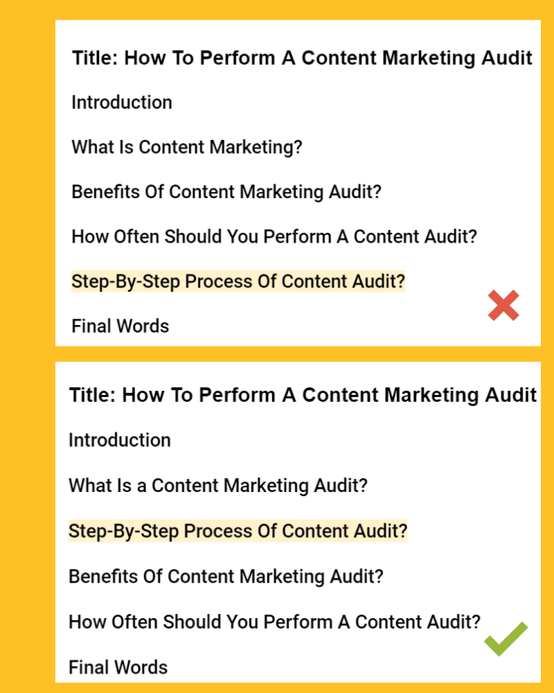
Here, the most important part of the content is the step-by-step process to perform the content audit. Therefore the best way is to make that section near the top, not at the bottom.
Key learning: While creating the content structure, think of the most important information/section for the users. Make that section closer to the beginning and easy to access.
2. Content Categorization
One of the key principles of blog UX is to make the content easy to access. But if you visit the blog page of businesses, you’ll see a different story.
They may have published hundreds of articles but the blog page shows only the last ten articles.
This is a similar example from scripbox:
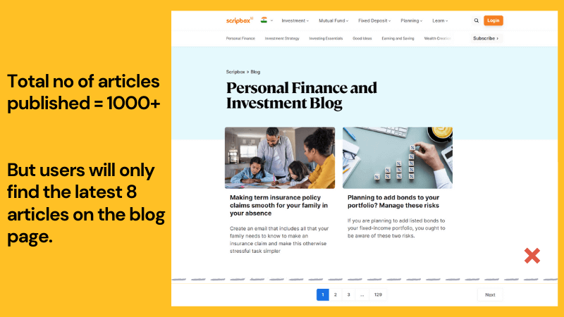
At Scripbox, they have published over 1000 articles but the blog page shows only the last 8 articles.
This is a poor example of content categorization.
Solutions?
Categorize your entire content inventory by topics, content types, etc.
Here’s an example from ServiceTitan where they have categorized their huge content inventory by topics and industries.
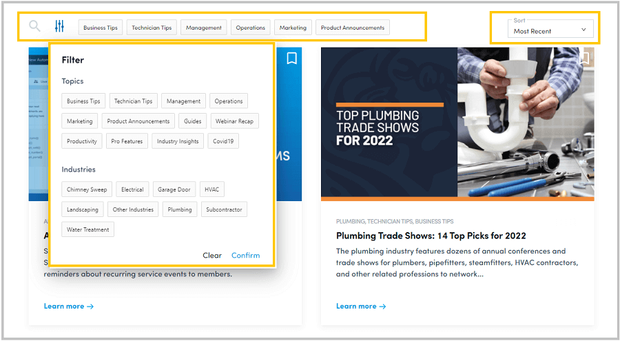
Another example of categorizing blog articles by topics.
Key benefits?
- From an SEO point of view, this helps to pass the page rank from the blog page. Without categorizing like this, your old articles will be hidden under many clicks which is not good in terms of crawling and passing link juice.
- It allows your users to find the articles by topics or categories even though the article was published a year ago.
Relevant read: Content marketing experts giving their top strategies
3. Adding Expandable TOC
Adding ‘Table of Content‘ in articles (especially 2000+ words) seems like a simple element to add yet so many blogs miss this.
Two key reasons why TOC helps improve the user experience:
1. Helps to reduce the Time-to-value by helping readers scan the article and go to the desired section of the article
2. TOC helps in triggering the site links in the SERP. As a result, there is a chance of improving CTR.
Sometimes, adding too many elements in the TOC can be overwhelming for the readers, especially on mobile devices. For that reason, expandable TOC is a great option.
Here’s an example from Investopedia that uses expandable TOC consists of two columns:

4. CTAs and Product-Led Content
One of the mistakes people make in publishing articles is that they either don’t focus on converting blog traffic to customers or they overuse the CTAs within the article.
In both cases, the conversion rate will suffer.
Remember that every blog article has a purpose more than just traffic. Usually, it could be any one of the following:
- Getting email subscribers or leads
- Driving traffic to the eCommerce store
- Acquiring natural links over time, etc.
Therefore you have to be clear about the purpose before designing the right CTA for the article.
Here are some examples of adding CTAs within the article:
Example 1. Add Related Product Buttons
This is often used in product-related listicle-type articles. Instead of linking to the contact us page, link to the product or category pages.
Benefits?
- It will help increase the PageRank of those product/category pages.
- This will leads to higher conversion
Relevant read: Summary of they ask you answer (content marketing book)
Example 2. Image CTAs For Service Businesses

Image-based CTAs also work for service businesses. Make sure the CTA is relevant to the specific article.
Mistake to avoid: Never use the same CTA for all articles.
Example 3. Product-led content
Product-led content is one of the best ways to drive leads and conversion from articles.
Here’s what the product-led content means:
“Content where the product is woven into the narrative to illustrate a point, solve a problem, and/or help accomplish a goal.”

“Content where the product is woven into the narrative to illustrate a point, solve a problem, and/or help accomplish a goal.”
Here’s an example from Shopify:
Shopify published an article about “How to Start Dropshipping in India.”
Users’ need: To learn the dropshipping process
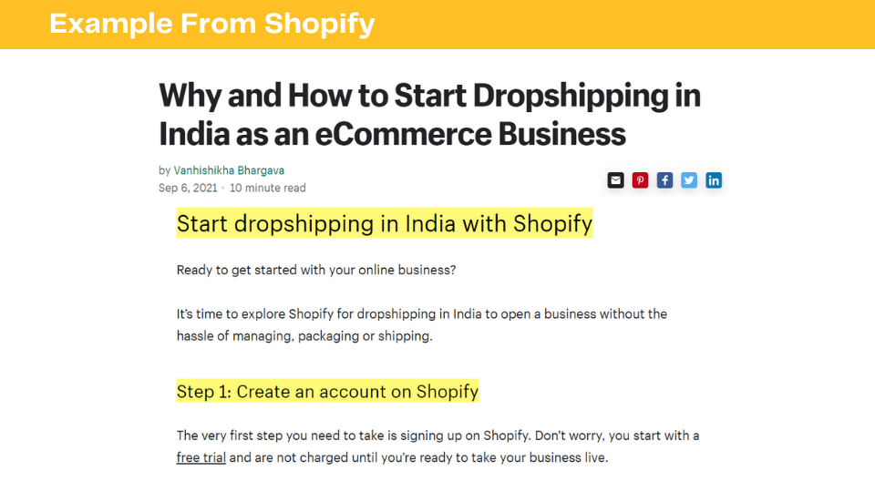
But Shopify didn’t just share the process to start dropshipping. Instead, they have turned their product (eCommerce platform) into a solution to teach about the dropshipping process.
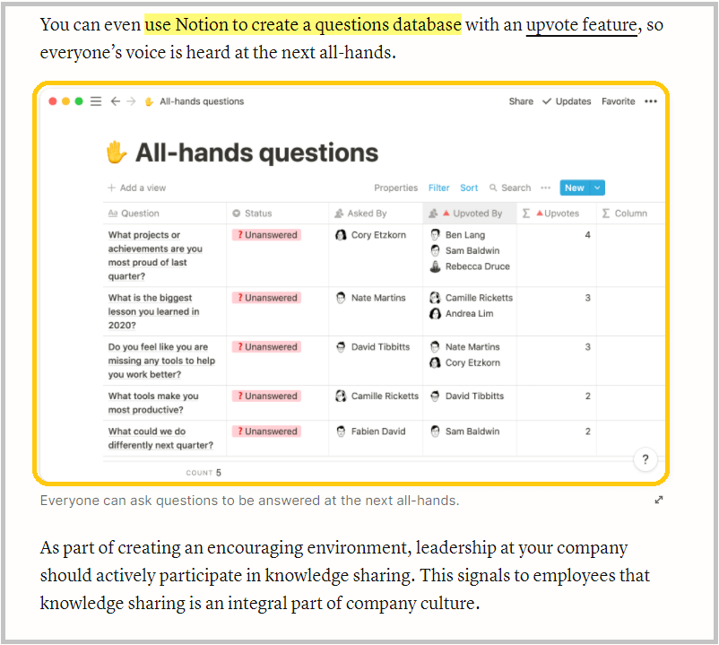
Here’s another example from Notion.
Notion publishes a lot of helpful articles for startups.
One of them is about “How to improve knowledge sharing within your startup” where they have presented Notion as a solution by adding:
- Product screenshots
- Gifs
- Product features, etc.
This is what it looks like:
Product-led content isn’t only applicable for SaaS businesses. Even service businesses can get a high conversion rate with this approach.
One of their popular articles is about “SaaS content marketing.”
In the traditional approach, you’ll see articles sharing the strategies of SaaS content marketing or some marketing examples of brands.
But here the GrowAndConvert team did a great job by turning their service into a part of the solution.
Here’s how:
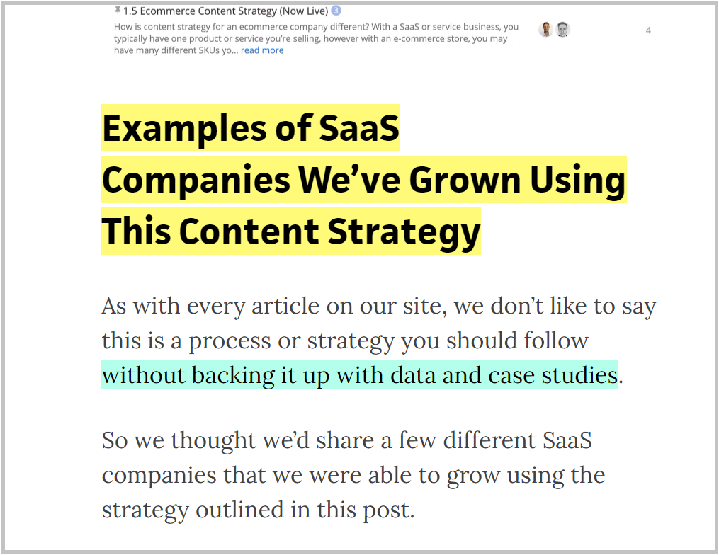
In the article, they are not only sharing the strategies but also case studies where they got results for their clients using the same strategies.
5. Blog Sidebar
Blog sidebar is a great place to not only add relevant articles but also add CTAs to drive higher conversion.
Before that, we need to bust a common SEO myth which is that links from Sidebar or footers will give you huge benefits in terms of passing page rank from one page to another.
Here’s why:
Google gives more importance to the internal links within the content as compared to the sidebar.
Therefore, sidebar links should be considered more from the conversion and user’s perspective rather than SEO benefits.
What to add to the blog sidebar?
I prefer three sections for the sidebar such as:
- Image-based CTAs
- Related articles
- Blog categories
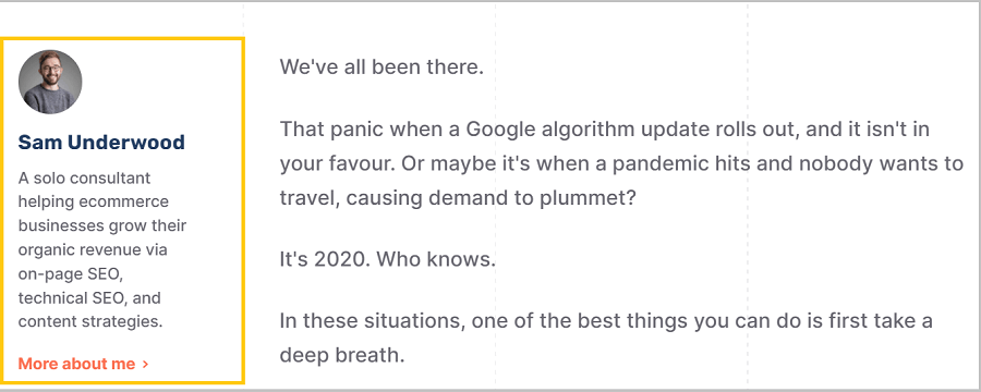
- Author image with bio
First of all, this helps you drive attention to the CTA. And, this might help you get better clicks and conversions.
Second, ‘related articles’ or ‘blog categories’ are helpful to improve the accessibility of your content inventory. As a result, Dwell time will increase.
Third, the author’s image helps in building a connection with your readers.
6. Demonstrate EAT
SEO (especially in YMYL niches) is beyond quality content and links from high authority sites. It is also important to have your site authority, expertise, and trustworthiness on the content topics not just for search engines but also for the readers.
Therefore to improve the blog UX, you need to demonstrate EAT of the article and let the readers know why they should trust the information on the article.
I am not diving into the technical details of EAT. You can check out my article on EAT for SEO to know more.
Here are some examples to demonstrate EAT:
1. Expert reviewer and content citation
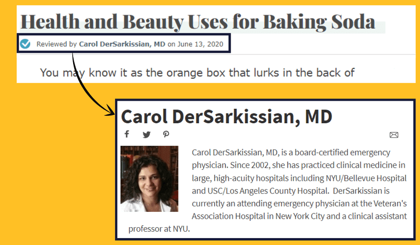
For niches like finance and health, having a medical expert or expert reviewer will help you build credibility.
In this case, most of the articles of WebMD are reviewed by a medical expert whom readers can trust.
Another example is from Healthline:
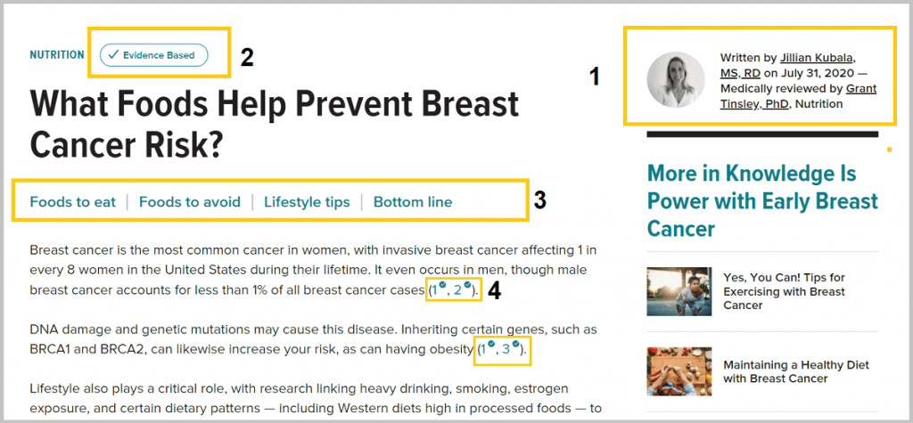
1/ The most important factor that will help readers to trust the content is by knowing whether the article is written by an expert or not.
Also in the QRG, it says that:
“Highest quality pages and websites have a very high level of expertise or are highly authoritative or highly trustworthy.
Formal expertise is important for YMYL topics such as medical, financial, or legal advice.”
Therefore adding the academic qualification is important in YMYL sites.
2/ The badge of ‘Evidence Based‘ shows that the content is fully checked and reviewed by the experts and medical professionals.
When clicked on the ‘Evidence Based’ badge, readers will get to see a pop-up box where they can see the list of experts and the process followed to make the content accurate.
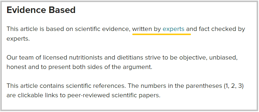
This is also helpful in building EAT as mentioned in the quality raters guideline (QRG).
3/ The Table of Contents is a great way of improving the user experience, especially for the long-form content.
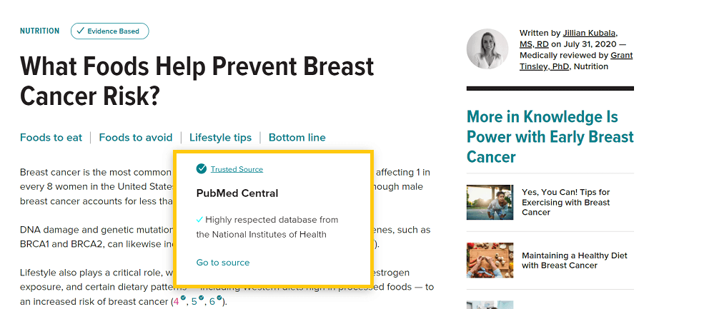
4/ Another important aspect of quality content is adding citations and adding proofs to the medical claims. Healthline has now focused more on the sources and citations.
In most cases, you won’t see any article or medical claims without adding authoritative sources to verify.
Here’s an article showing the trustworthiness of each external source or link.
7. Bonus Blog UX Tips
1. Featured image
You’re probably using featured images for blog articles. But instead of using a large-sized featured image, try a small-sized image along with the title (2-column):
Here’s a snapshot of Semrush blog:

The main benefit of using 2-column for above-the-fold content is reducing the page load speed (core web vitals).
2. Font family, spacing, and font colour
Most common mistakes you’ll see in blog articles are:
- Thin and small font
- Font colour is grey (hard to read)
- Not user-friendly font
- Blog width is too large
Final Words
Competing in the content marketing game, well-optimized blog UX design may give you a competitive advantage.
I hope these seven tips will help you improve the blog UX design for higher conversions and readability.
Not yet a content marketing VIP newsletter member?
Subscribe to the bi-weekly content marketing newsletter and get actionable insights to help you get traffic, leads, and conversion.

Sk Rafiqul Islam is a content marketing practitioner with 3+ years of practical experience. He spends most of his time helping businesses to build a loyal audience with content marketing. He is also running a tech career blog called 10Pie and content marketing VIP, a bi-weekly marketing newsletter. In his free time, he loves reading books and playing football.